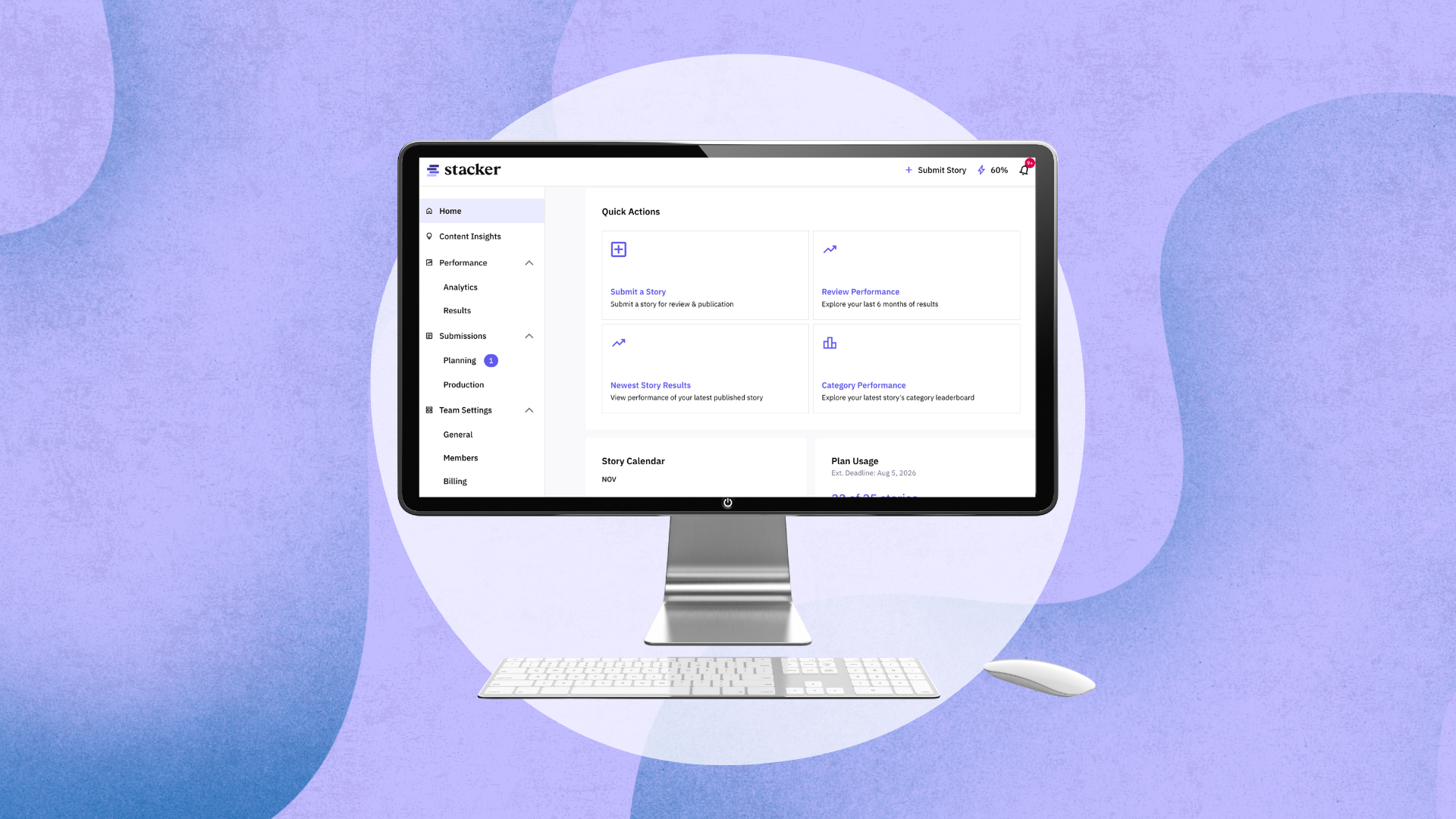
 Designing Stacker Portal 3.0: How to Create a Useful Product Experience"
class="blog-post-hero-img">
Designing Stacker Portal 3.0: How to Create a Useful Product Experience"
class="blog-post-hero-img">

The best product experiences match how people naturally think and work. When it comes to earning media attention and placements, the stages of work broadly include planning ideas, producing stories, distributing them, and evaluating performance, so we built the new Stacker portal to match how people move through their day with clear starting points, fewer dead ends, and information that appears when it’s needed. Every change reflects a move toward clearer structure, better insights, and a smoother path through the work users do every day.
We shared what shipped in Portal 3.0 here. Here’s a deeper look at how the redesign reshaped the experience to empower more strategic content decisions.
Homepage: Bird’s Eye View Into Performance
We built the new homepage to provide an at-a-glance look at performance and top performers so users have a single place to understand basic status or performance without any clicks. The redesigned homepage puts the most relevant information at the top so users don’t have to search for it.
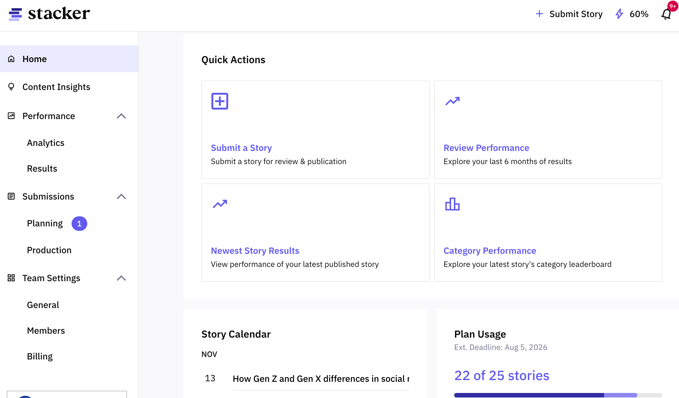
The page now shows:
- Top-performing stories
- Key performance signals
- Upcoming stories and deadlines
- Recent activity
- A clean list of all stories
Each element appears here because it answers a question users tend to have immediately after logging in. Instead of gathering these answers from across the portal, users can find them in one clear, predictable place.
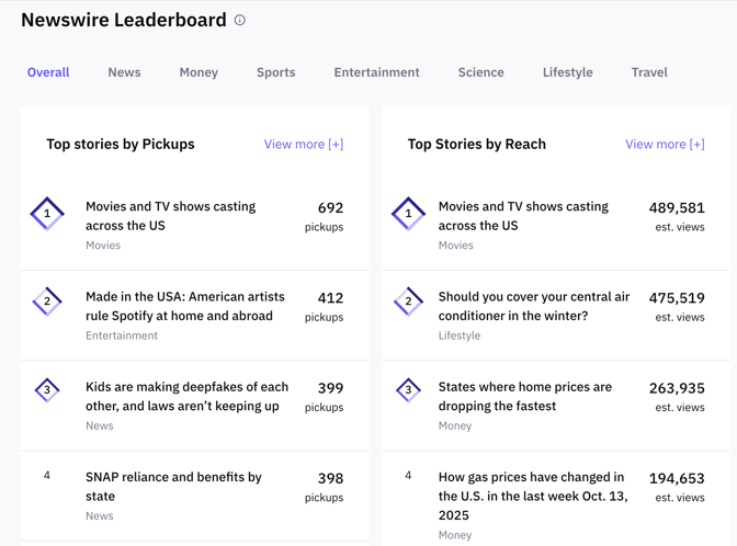
Content Insights: Helping Users Spot What’s Working
The Content Insights page helps users plan with more confidence by showing patterns in how stories perform across the network. It presents information in ways that make trends stand out without requiring users to do their own analysis.
Sparks are AI-assisted recommendations placed above the fold because this is where users are already thinking about what to publish next. Instead of leaving the insights page with a question about what to do next they leave with direction.
Leaderboards show top-performing stories because rankings are one of the easiest ways for people to compare information quickly. Category charts sit nearby so users can make decisions about where to publish their next story to broaden their reach and maximize their impact from a diverse group of publishers.
Results Page: Letting Users Compare Stories Without Overthinking
The Results page organizes all story performance in one simple table. Tables can be overwhelming when not designed carefully. so this one follows a clear reading order: story information on the left, performance signals moving right. This mirrors how people typically scan documents and spreadsheets.
Sorting and filtering aren’t included just for convenience; they help users narrow their view without losing context. The page avoids showing more detail than necessary so users don’t get bogged down in information they’re not looking for. If more depth is needed, each story can be opened individually.
The guiding idea is that a user should be able to tell, within seconds, which stories stand out and which need attention, without digging through charts or complicated controls.
Analytics Page: Empowering Users to Understand their Data
Some users want to compare specific groups of stories based on themes, or any set of their choosing. The Analytics page exists for those moments.
Custom date ranges and cohort selection allow users to create their own slices of data. Performance is then shown in an aggregated form so they can understand the bigger picture without flipping between individual stories.

Trends are shown visually because people often recognize movement up, down and steady, faster than they interpret numbers. This page exists to give space to explore, compare, and investigate.
By separating this deeper functionality from the Results page, the design avoids overwhelming users who only want a quick summary. This keeps everyday tasks simple while still giving power users the tools they need.
Planning Page: Reducing Uncertainty in Early Stages
The Planning page shows all ideas and stories before they enter production. This page serves to provide users with clarity during the early stages when there are a lot of moving parts, including new story ideas and upcoming deadlines.
Instead of burying approval states, the page groups ideas by where they stand: awaiting internal review, awaiting client approval, or preparing to be placed on the editorial calendar. Users don’t need to remember what step comes next; the layout makes the sequence visible.

The design reflects a basic truth of workflow software: people shouldn’t have to guess what’s holding something up. By making each stage distinct and orderly, the Planning page helps teams keep momentum and prevents ideas from disappearing into a black box.
Production Page: Showing Progress Without Needing Explanation
Once a story moves into production, users want to know exactly where it sits in the editorial process. The Production page lays out each stage in a straight line: a story being calendared, it being prepared for distribution and being distributed.
This structure mirrors the real sequence that stories follow. When the layout matches the process, users can scan the page and instantly understand progress.
Action items appear next to the stories that require them so users don’t waste time switching pages or hunting for tasks. The goal is to reduce the mental effort of “figuring out where things stand” and to help users recognize meaningful changes instantly.

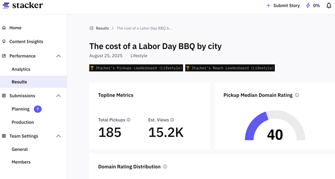
Story Results Pages: Bringing the Important Signals Forward
Individual story results pages highlight the most important performance signals at the top: pickups, estimated views, and high-authority placements. These are placed first because they answer the most common question users have: “How did this story do?”
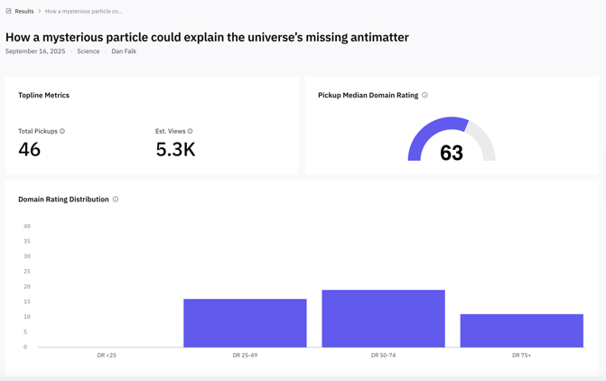
The page avoids decoration and focuses on clear grouping, spacing, and order. The aim is to help users recognize the meaning of the numbers without explanation and provide salient look at distribution impact.
Team and Profile Settings: Keeping Administrative Tasks Painless
Team and profile settings are designed to be as simple as possible. Tasks like adding teammates, removing them, or adjusting roles appear in predictable locations, with straightforward controls. This keeps administrative work from disrupting more meaningful activity in the portal.

A Portal Built for Streamlined Content Distribution
Across all pages, the redesign aligns information with how people naturally process it:
- Important things come first.
- Similar things stay together.
- Changes stand out.
- Detail appears only when needed.
- The structure mirrors the user's real workflow.
The result is a portal shaped not by features alone, but by insights into how people make sense of information and how they move through their work. The product is consistently informed by the conversations we have with our clients and helping them make impactful distribution decisions with a useful experience guides each update we make.
Don’t hesitate to let us know what you think.
Sam Kaye is a Product Manager at Stacker. He holds a BA in Journalism from San Diego State University and has a background in audience development, local journalism and SEO.
Photo Illustration by Stacker // Canva