The famous bull statue outside the New York Stock Exchange.
Stacker Studio

These 5 charts show the ups and downs of the US stock market over 10 years

Written by:
January 26, 2023
Canva

This story originally appeared on Olive Invest and was produced and distributed in partnership with Stacker Studio.

These 5 charts show the ups and downs of the US stock market over 10 years

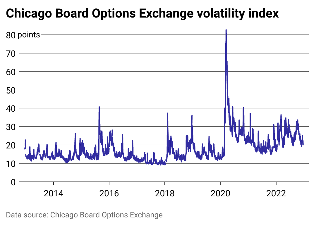
The U.S. stock market is a complicated beast, and with recent events like the COVID-19 pandemic, we've seen some volatility in the last few years. Stocks dipped quite a bit during the pandemic but have recovered since.

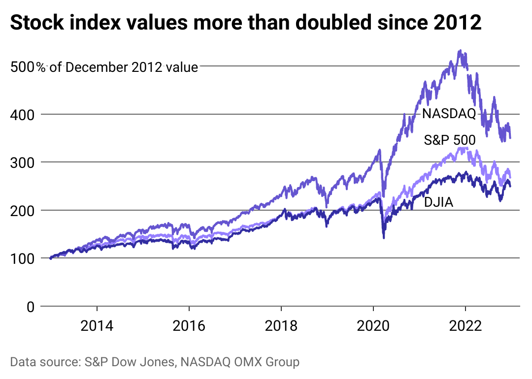
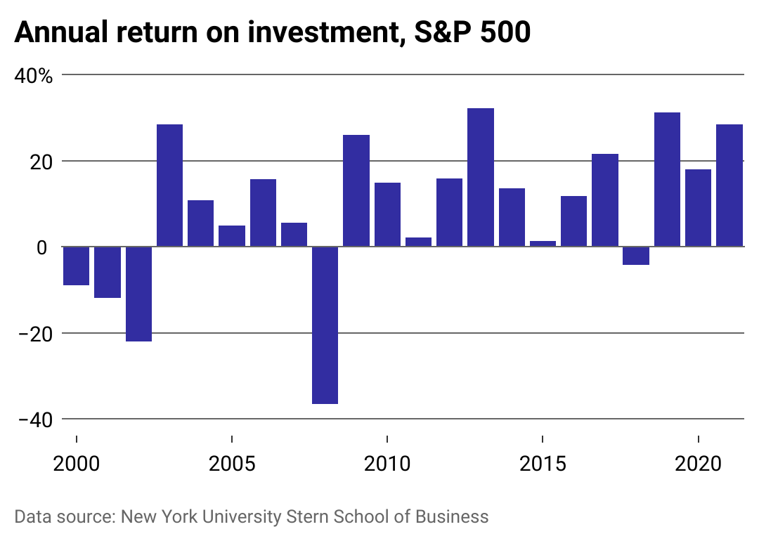
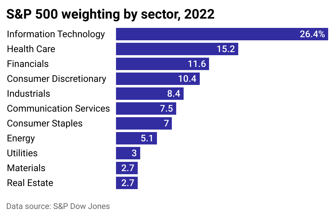
To get an idea of how the stock market has fared in the last 10 years, watch trends of major market indices—or certain groups of companies' stocks that give a sample of how the entire market is performing. Perhaps the most well-known market index is the S&P 500, a group of the 500 largest companies on the U.S. stock market.

While the S&P 500 is widely regarded as the best indicator of how the stock market is faring, other market indices can give you a different view based on the type of companies they track. Dow Jones, for instance, follows 30 of the largest companies in the country from various industries. The NASDAQ includes all stocks on the NASDAQ market, largely comprised of tech companies.

By watching the performance of these and other market indices, investors can get a good idea of how the U.S. stock market as a whole has performed over time. Olive Invest examined historical equities data from S&P Dow Jones, NASDAQ, and other data sources to see how the stock market has fared over the last decade.

Chart showing that stock values more than doubled since 2012.
1 / 5
Olive Invest

How stocks have performed over the last decade

This chart shows a significant increase in stock index values from the last decade, despite a brief drop in 2020 during the pandemic. At the start of the COVID-19 pandemic, there was a steep drop-off in index values. However, they bounced back by the end of 2020 into 2021.

Index values have held relatively steady growth across the last 10 years. The NASDAQ, S&P 500, and Dow Jones Industrial Average have all doubled in value since 2012.

A chart showing the Chicago Board Options Exchange volatility index since 2012.
2 / 5
Olive Invest

Tracking volatility

This chart measures the Chicago Board Options Exchange volatility index (VIX index), designed to show how current events and uncertainty affect stock prices. Essentially, the more fluctuation you see here, the more uncertainty investors and the public have about the future, which can significantly impact the market and even help project market crises.

Unsurprisingly, the most significant spike in volatility from the last decade was in March 2020, at the beginning of the COVID-19 pandemic. The last two years have shown a reduction in volatility since this spike, but in general, there is more uncertainty than 10 years prior.

A chart showing the S&P 500 annual return on investment since 2000.
3 / 5
Olive Invest

Rates of return since 2000

The S&P 500's annual return on investment is a critical indicator of the stock market's performance. The average return since the S&P 500's establishment is 11%.

There are a few notable data points here—perhaps the most prominent of which is the Great Recession in 2008. That financial crisis resulted in the most significant drop in the S&P 500 return of the last 20 years. Since the recession, however, the rate of return has been above average almost every year.

Bar chart showing S&P 500 weighting by sector for 2022.
4 / 5
Olive Invest

S&P stocks by sector

The S&P 500 tracks the top 500 U.S. companies on the stock market. Knowing what types of businesses make up the majority of the index is essential to understanding which sectors have the most success.

In 2022, Information Technology made up 26.4% of the S&P 500—an industry high in the last 20 years. Similarly, health care is gaining ground in the previous few years, though it is still short of its historical high.

The financial sector has seen a downturn in the last decade—though this may change with the reclassification of major shares next year.

Chart showing a significant drop in how many publicly traded domestic companies are on the U.S. stock market since 2000.
5 / 5
Olive Invest

Number of publicly traded companies declines

In the last 20 years, there has been a significant drop in how many publicly traded domestic companies are on the U.S. stock market as more companies exit the market and there are fewer IPOs.

The last decade, however, has been far more stable. Experts suggest the change is connected to natural fluctuations and changing dynamics in the market's major industries. McKinsey attributes a significant portion of the drop-off to acquisitions.

Still, there have been fewer IPOs in the last several years, which can be a disappointment for new investors trying to get in on the ground floor.

Trending Now