Canadian company logos then and now
Canada has a rich, diverse culture and history and is a flourishing, wealthy, capitalistic society that gave rise to some of the greatest companies and brands in the world. Canada's biggest businesses make tens of billions of dollars in revenue every year and have a global reach.
Like Canadian culture in general, many of those companies have evolved over time and their logos have evolved with them. The Iceland Vikings who colonized Greeland reached Canada 1,000 years ago, but the first significant exploration began with John Cabot in 1497, although English settlements didn't spring up until the early 17th century.
The British and French battled for supremacy, and the country is still roughly divided by the remnants of those two cultures and languages. From the very beginning, Canada was a cash-generating machine for European businesses—most notably, the historic Hudson's Bay Company, which dominated the lucrative North American fur trade so thoroughly that it served as a de facto government in some places.
The company gave rise to Canada's modern capitalist culture, and by the late 18th century, Canada's first financial institutions began emerging to accommodate the mountains of money generated by the harvest of timber, fur, fish, and the rest of Canada's seemingly boundless natural resources. To differentiate between companies that were competing to sell virtually identical commodities, businesses developed logos that represented their brands. That tradition continues today, although many of today's logos would be unrecognizable to those early pioneers.
Using corporate reports, press releases, news articles, and other primary sources, Stacker compiled a list of 20 companies and their evolving logos that are instantly recognizable to America's friendly neighbors to the north. In some cases, the branding changes were barely noticeable. Other times, companies built entirely new logos from the ground up.
Read on to see Canadian company logos then and now.
Then: Royal Bank of Canada
The company that was long known as the Royal Bank of Canada is the largest financial services company in the country. It serves 16 million clients across the world and employs over 86,000 people. It’s lion and globe have been staples of its logo for decades.
Now: RBC
In 2001, the Royal Bank of Canada changed not only its logo, but also its corporate name, becoming RBC Financial Group. The move was designed to indicate its international status and to streamline several subsidiary businesses under one umbrella brand. The old logo remained on some businesses, literature, and signs for a few years but the new look was fully incorporated by 2004.
Then: Scotiabank
The financial firm that Canadians know as Scotiabank was founded in 1832, but was known as The Bank of Nova Scotia until 1975. Boasting more than 98,000 employees, the company serves more than 25 million customers worldwide.
Now: Scotiabank
In 2019 Scotiabank gave its logo a facelift, stating on its website that the desired goal was a “more modern, confident and legible look with every piece of communication.” Designers centered the “T,” balanced the “C,” and increased the cap height.
Then: Bank of Montreal
With more than 200 years of history, the Bank of Montreal has financed some of Canada's most significant national projects. In 1967, it unveiled its famous M-bar logo, which was the centerpiece of a branding campaign designed to modernize the bank's image. It would remain for 35 years.
Now: BMO Financial Group
The Bank of Montreal updated its logo in 2002 to what it calls the “BMO roundel” and also took on a new name: BMO Financial Group. Like RBC, it was as much of a consolidation effort as a branding change. At the time, more than 30 businesses were operating under the company, and the move to BMO grouped them all together.
Then: Air Canada
The country’s largest airline in terms of both domestic and international travel, Air Canada has a presence in 210 airports on six continents. Its fleet contains more than 400 planes that are among the world’s youngest and most energy-efficient commercial aircraft.
Now: Air Canada
In 2017, Air Canada shocked the branding world when it added black lettering and a curved stem to its iconic red-and-white Canadian maple leaf logo on the livery of its fleet (a livery is pretty much any graphic design on an airplane). It was only part of a much larger branding transformation that included updated uniforms for the staff.
Then: The Bell Telephone Company of Canada
A large and historic firm, The Bell Telephone Company of Canada was directly tied to the Bell company headquartered in the United States. The U.S. Justice Department filed an antitrust suit against the company in 1949 and the following decade signaled the start of a series of divestment agreements that eventually led to the company’s breakup in the 1980s.
Now: Bell Canada
Officials authorized the corporate name of Bell Canada in 1968. While that name has stuck, the company's logo has changed several times over the years and decades.
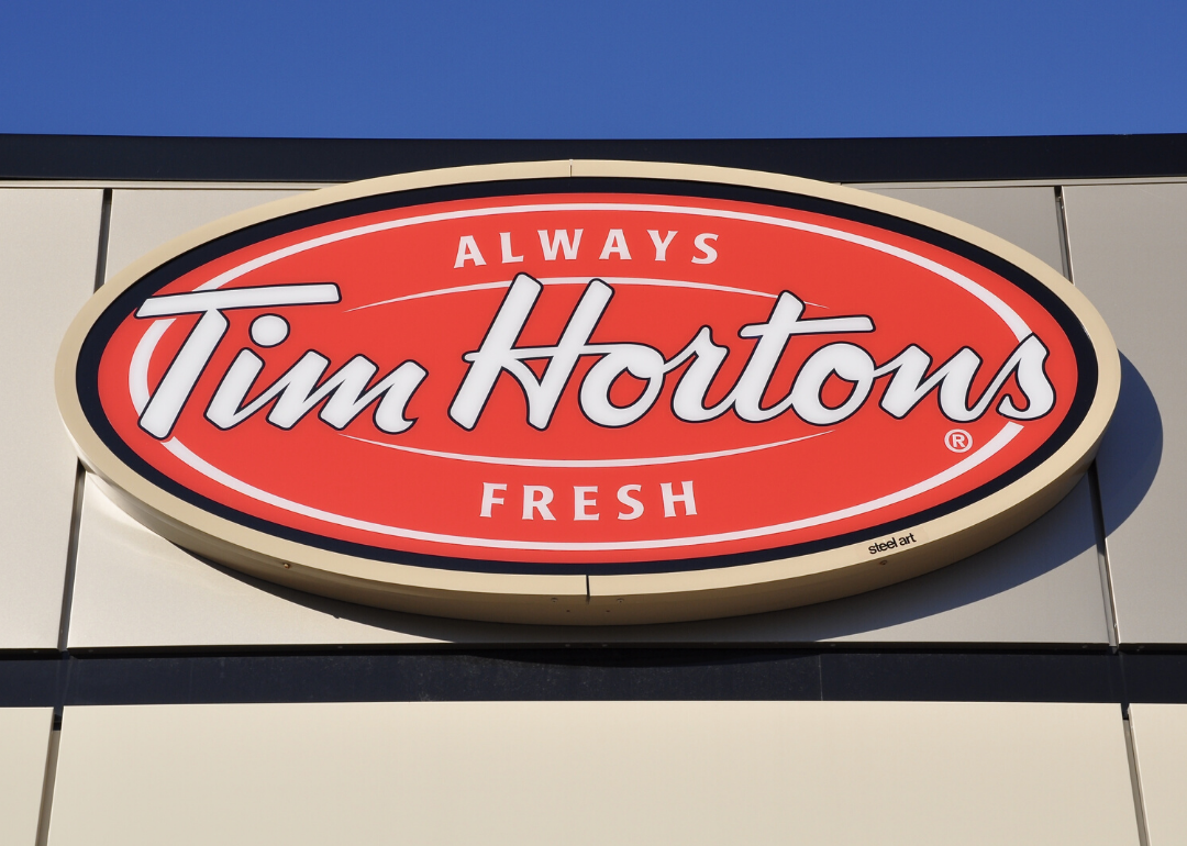
Then: Tim Hortons
Tim Hortons is a fixture of Canadian culture and the largest quick-service restaurant in the country. Founded by a famous Canadian hockey player of the same name in 1964, it originally served only coffee and doughnuts. Wendy’s purchased the chain in 1995 and then sold it to the company that owns Burger King in 2014.
Now: Tim Hortons
Although it was sold and then sold again to giant fast-food corporations, Tim Hortons is still Tim Hortons—but the logo has changed quite a bit over the years. It started as just the signature of the Toronto Maple Leafs great who founded the first restaurant (which is still the centerpiece of the logo). Eventually the tagline “Always Fresh” was added, first with a linear brown-and-gold image that evolved into the modern red, white, and black oval.
Then: Canadian Broadcasting Corporation
The primary public broadcasting source for both radio and TV in Canada, the CBC is a company that has become synonymous with the nation. The company’s forerunner was created in 1932, and the CBC has evolved and expanded both its program offerings and audience over the decades and into the digital age.
Now: Canadian Broadcasting Corporation
The CBC’s logo varied frequently and dramatically for the first half of the company’s existence. In 1974, however, graphic artist Burton Kramer developed the iconic logo known as “the gem,” a kaleidoscopic red, orange, and yellow image radiating outward from the center of a blue circular background. The gem has changed over the years, but its central image remains, although it’s completely red now and the circular background is gone.
Then: McCain Foods
The four brothers of the McCain family were the sons of third-generation farmers when they founded McCain Foods in 1957. The company now has products not only all over Canada but in more than 160 countries around the world.
Now: McCain Foods
McCain evolved rapidly and repeatedly over the years—but its logo did not. In 2013, however, the company announced its first major rebranding in 50 years. In partnership with BrandOpus, the company overhauled the graphics on its entire portfolio of products, introducing the sunshine focal point.
Then: WestJet
WestJet launched in 1996 as a low-cost competitor to Canada’s major airlines and is now the second largest airline in the country behind only Air Canada. The delta symbol, which represents the Canadian Rockies, joined the maple leaf as the basis of the company’s logo from that year to the present day.
Now: WestJet
In 2016, WestJet unveiled a new design that incorporated their corporate colors of teal and blue. It kept the iconic maple leaf and delta symbols. The result was a new logo that, according to a company study, customers associate with Canada five times more than the original.
Then: Sun Life
Founded in 1865, Sun Life has changed names and logos several times as its products and company evolved. It was Sun Life Assurance Co., then Sun Life, then Sun Life of Canada, then Sun Life Financial, until it reached its current iteration. With each name change—and several times in between—the logo changed, too.
Now: Sun Life
In 2019, Sun Life Financial became Sun Life again to reflect a change from the company's roots as a life insurance company to the global financial and health conglomerate it's become. The name change came with an updated logo—the familiar graphic sun beside the company's name in tall blue font.
Then: Molson Canadian
Along with Moosehead and Labatt’s Blue, Molson is Canada’s beer. The oldest brewery in North America, the Molson Brewery was first established in Montreal in 1786. Its iconic flagship Molson Canadian lager debuted in 1959 to immediate success. In 2005, Molson merged with Coors and became the Molson Coors Brewing Company, although the Canadian Molson Brewing company retains its name.
Now: Molson Canadian
For generations, Molson Canadian was instantly recognizable for its oversized maple leaf and alternating red-and-blue lettering. In a logo conversion that’s been widely panned by brand loyalists, it’s now a cursive script with dark blue and red letters that don’t contrast as sharply.
Then: Labatt’s Blue
The Labatt Brewing Company is the biggest brewer in Canada. It’s flagship beer—popular both in Canada and the U.S.—was called Labatt’s Blue until the 1990s. During that time, however, the company engaged in a significant marketing push that rebranded the pilsner as Labatt Blue.
Now: Labatt Blue
The most significant change to come out of the rebranding effort was the name change when the company dropped the possessive. It also dropped the dated slogan, “Call for Labatt’s Blue,” dramatically increased the size of the word “Blue” on the label, and streamlined and brightened the color scheme.
Then: Canadian Tire
Canadian Tire is one of Canada's biggest brands. It operates 1,700 retail stores that sell automotive parts, hardware, and related products. Each store in the chain also maintains a working garage for repairs and installation. Its image and logo have gone through many changes since it was founded in 1922.
Now: Canadian Tire
In the 1920s, the company logo was a cartoon tire with a face and limbs, which switched to a red-and-black seal and ribbon. Then in the ’50s, the company switched to the now-iconic inverted red triangle topped with a green maple leaf. That evolved into a sharper image with a crisper font, which, finally in the 2000s morphed into its current state, where the company’s name is written in a wide, red, uppercase font outside the triangle.
Then: Cirque du Soleil
In 1984, 20 street performers launched what would become the alt-circus entertainment juggernaut Cirque du Soleil. It now puts on shows across the world and employs 4,000 people. The company has entertained 180 million people in 450 cities in 60 countries.
Now: Cirque du Soleil
The original logo appeared to be hand-drawn—it had a muted watercolor look that depicted a rising sun over blue water mimicking the look of the company’s big tops. That logo prevailed until 1991, when a crisp and modern black-and-white logo was chosen—it also depicted a sun with beaming rays. Finally, in 2017, the sun image received another makeover that added gold coloring and simpler, less-cluttered design.
Then: Harvey’s
A fast-food chain with more than 60 years of history, Harvey’s is a fixture in every province. Known for its grilled burgers and wide selection of optional toppings, the company has changed logos three times, but it has always featured the word “Harvey’s” sandwiched between two burger buns.
Now: Harvey's
From its founding in 1959 all the way to 1997, the logo was a dull orange-and-white Harvey's burger. Then it turned dark blue with a curvier-shaped burger, the bun got seeds, and the font changed. Finally, in 2006, the color scheme changed again but the shape of the burger stayed the same.
Then: Hudson’s Bay Company
Founded in 1670, the Hudson’s Bay Company is the oldest business in North America and one of the most important organizations in world history. It helped build Canada and the continent, functioning as the unofficial government for two centuries. At its peak, it controlled the fur trade across the British Empire, but today it’s a retail business group that recently gave its logo a long-overdue makeover.
Now: Hudson’s Bay Company
By 2013, the Hudson’s Bay Company hadn’t updated its logo in half a century. Before 1965, it represented the company’s colonial European heritage, complete with wild animals, a royal shield, and Latin phraseology. Since 1965, it used simply “The Bay” logo. Finally, the company went with a modern, mall-ready logo consisting of “Hudson’s Bay” uppercased in a slick font.
Then: Husky Energy
Although it was founded in 1938 in Cody, Wyoming, Husky Energy is headquartered in Calgary, Alberta. Throughout its history, the global oil company has changed its business model, capacities, and even its name. Along the way, its look and its logo changed, too.
Now: Husky Energy
From its founding in 1938 through 1947, the company’s Husky Gasoline logo featured a dog that was perhaps more wolf than husky. In 1947, the company dropped the “gasoline” from the logo and featured a dog on a gas station platform sign. The dog disappeared altogether from 1960–79, but that year, the dog re-emerged—at least its head did—but in a simpler form on the simple red, white, and blue logo Canadians know today.
Then: Bombardier Inc.
With a history dating back to 1937, Bombardier Inc. traces its roots to the innovative new snowmobiles that were the company's foundational products. Today it's a global manufacturer of planes, trains, and aerospace technology and machinery.
Now: Bombardier Inc.
The logo used to consist of the company’s name inside of a gear-wheel. The new, less-cluttered look, however, removes the wheel altogether and consists of only the word “Bombardier” in a heavy, bold black font.
Then: CTV Television Network
What started as the Canadian Television Network in 1960 evolved into what Canadians now know as the CTV Television Network, although they just call it CTV. A broadcasting powerhouse since the 1970s, CTV has been Canada’s most-watched network for nearly two decades straight.
Now: CTV Television Network
In 2018, CTV updated its logo, but the changes are easy to miss for those who aren’t looking closely. Everything is the same—the letters C, T, and V appear in thin white font inside a red circle, blue square, and green triangle, respectively. The colors are now just a bit more muted and they removed the shading, which eliminated the illusion of depth.
Then: Irving Oil
Founded in 1924, Irving Oil is an energy powerhouse in Canada. It maintains the country’s largest refinery, owns a network of distribution channels, and operates nearly 1,000 fueling stations nationwide.
Now: Irving Oil
The company's logo changed over the years, but not much. From at least the 1950s through 2004, the logo remained the same: the word "Irving" centered inside a linear blue border with red triangles. That year, the logo lost its blue border, the triangles were hollowed out, and the font changed and became more rounded.


